The ‘Analyse A Real PPC Campaign’ series last looked at Fragrance Direct who had interestingly created a PPC campaign for the term ‘fragrance’ even though they were organically ranked number already (the article explains what reasons there are for doing this). Since PPC campaigns are created for just about every market, in this article, I will be looking at the online video streaming market which is a growing market due to the affordability per month price many competitors adopt allowing people to watch thousands or even millions of hours of films and TV shows. The competitor I will be looking at today is, what can be considered the market leader, Netflix.
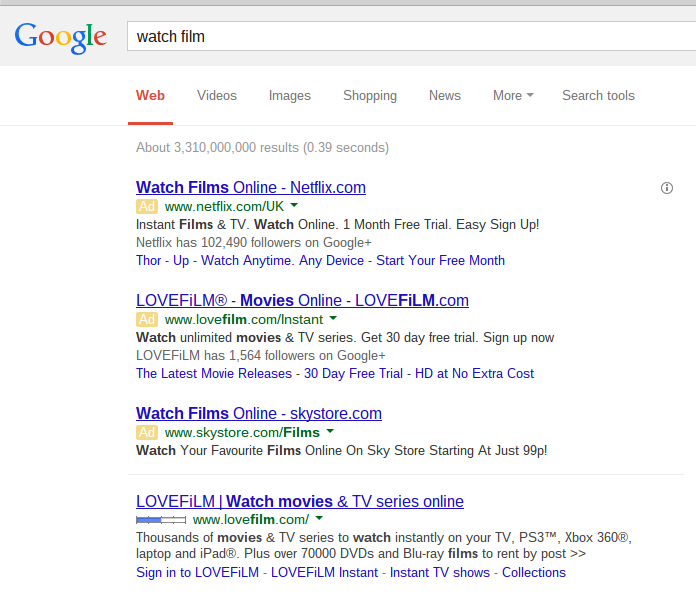
To view Netflix’s PPC text advert, I typed into Google search UK ‘watch film’:
What is made apparent is that Netflix has to make a campaign if they want to outrank their rivals LoveFilm. LoveFilm knows this so they made a campaign in an attempt to regain number #1 spot. However, it is clear Netflix has outbid LoveFilm for the top spot with a higher CPC. For this reason, LoveFilm’s campaign can already be seen as a bit of failure since Netflix are above them in paid search although having your site ranked number one does have its benefits too!
Looking at the advert itself, it is a well designed advert because of the following reasons:
- It’s keyword density related to the search phrase is high since ‘watch’ and ‘film’ appears both in the title and description. The URL doesn’t include it since Netflix is a large brand that most people know about. By also keeping the domain the same as it’s actual domain makes it easier for people to find Netflix without having to go through PPC.
- There is a call to action in the title being ‘Watch Films Online’. This is important since a call to action evokes an action from the web user increasing the CTR.
After clicking on the advert, I came to the following landing page:
This is a really nice landing page for the following reasons:
- Images are worth 1000 words. Netflix have decided to put a slideshow of pictures of people using Netflix on their devices in different situations. This goes to show the flexibility Netflix has with people and how it can mould into your life easy. The images are trying to relate to the web user – it’s a clever technique.
- It is beautifully simply. Netflix states what their service does and it’s pricing (which they are not ashamed of if they tell you straight up on the landing page!). Sometimes, simplicity wins in PPC as you need to remember that web users have a short attention span: there is always an alternative site to be on one click away!
- Netflix have made it clear what their intentions are with what they want as a conversion: you to sign up. Therefore, it is a great strategy to have the largest button the page to be the one that enables you to sign up. Again, Netflix have prioritised what they want on the landing page.


