My last article in the series ‘Analyse A Real PPC Campaign’ had a look at the upper-end watch company Rolex who tried to create a connection with the web user so that the web user’s shopping experience was personal: something very important to the selling of Rolex watches. This campaign goes to show that anyone can use PPC be it to sell something under a dollar to thousands of dollars. This article is going to look at a bank being NatWest and how they use PPC to their benefit.
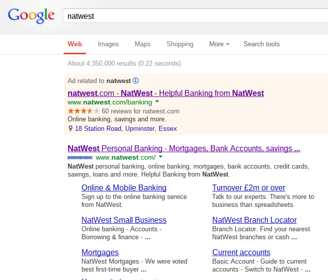
To view NatWest’s PPC campaign, I typed in ‘natwest’ into Google search UK:
The first thing I noticed was that NatWest are already #1 spot on organic search results anyway. From the past, we have gathered that some companies bid for their own brand name because competitors have done the same like O2 did against HTC mobiles. However, there is no competition for ‘natwest’ which, for me, means there are one-two of three reasons why NatWest bid for their own keyword:
- To scare other competitors away so that they don’t bid for ‘natwest’.
- To inform the web user of information that cannot be displayed organically.
- To move the web user onto a targeted page of NatWest’s website that isn’t the homepage.
After clicking on the advert, though, I came to the homepage of NatWest which means that the only sensible reasons why NatWest have done this is to show the web user of their ratings online or to scare the competition off.
Either way, the PPC advert itself is very simple with a extra long title and extra short description. Although it makes sense to make the title short to grab the web users attention and then the description long, having it the other way around can produce just as successful results. One key part of information that isn’t included in the organic search results of NatWest is their slogan ‘Helpful Banking’ (which may be an additional reason why the campaign made a bid for their own brand name?). Banks are trying to make people’s experience with banking as personal a possible and NatWest will be able to achieve this through promoting their slogan through PPC.
After clicking on the advert, I came to the following landing page which is also the homepage of NatWest:
The only actual difference between the homepage and this is the URL where the PPC landing page has ‘?extcam=N_ppc_GGL_XX_PurB_ZOM_natwest_Search’ extra on top of the normal URL (to analyse the performance of the page when the traffic has come from PPC.
Looking at the landing page itself, it is very colourful and seems to be packed full of lots of information. Like with most landing pages, there is a menu bar at the top to help the web user look through the rest of NatWest’s website. However, what I found interesting is the image that NatWest has used to support their ‘Cashback Plus’ message. It is not exactly related to Cashback Plus’s services. But, even so, because it is a very colourful and positive picture, it makes you want to use Cashback Plus. This makes clear that even if images are unrelated to the text, if they are positive and colourful, you might find them to be successful in bringing you conversions.


