
Natoora – Analyse A Real PPC Campaign 29 Oct 2014
The last article in the ‘Analyse A Real PPC Campaign’ looked at Lovell Soccer, who had many positive areas of optimisation. For example, the use of black for the background of the webpage web users land on would promote conversions since black is associated with being a dominant colour and fashionable. In this article, I will be looking at a pay per click advertising campaign by a company called Natoora that sell fresh fruit to be delivered on the internet. Let’s see how good or bad their campaign turns out to be…
To view Natoora’s PPC search advert, I had to type into Google search UK, ‘buy fresh fruit’:
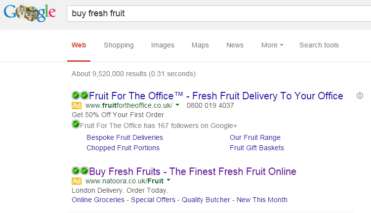 Straight away, I look to below the fold to see where Natoora are ranked organically – not even on the first page. This makes it clear a large proportion of the reason to them making the campaign in the first place: to gain traffic to their website they could never achieve organically.
Looking at the advert itself, here are some point I could bring out of it:
- Natoora have used an ad extension being the site link extension. This is good because it enables the web user to click onto more specific areas of the website if they should so wish to.
- The description is very short (maybe because of the slightly longer title?). Either way, they have used short sweet phrases with a call to action which is a great way to layout the description of search adverts.
- The start of the title ‘Buy Fresh Fruits’ is exactly what I searched with which will help increase the CTR. As well as this, its a call to action too which will help further gain clicks.
After clicking on the above advert, I came to the following landing page:
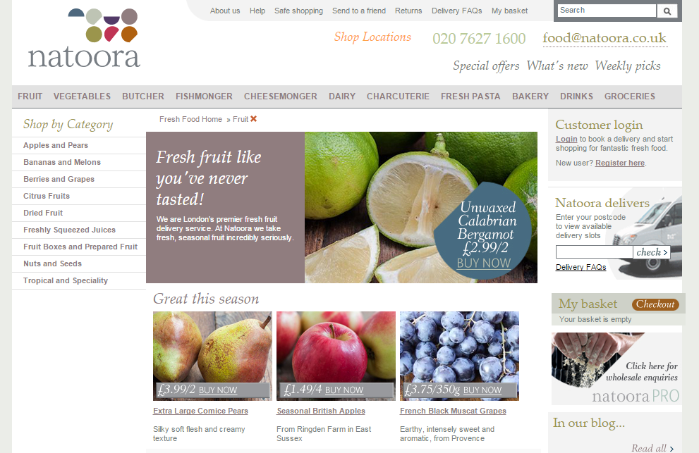 Below are the main points I found with this landing page:
- The layout of the page is near exactly the same as the homepage. Although this is not advised in PPC to do, if you have a well optimised homepage, then it is okay to do (just like in this case with Natoora).
- The menu navigation bar is clear to use but lacks the drop down navigation menus – something Natoora could look to implement.
- The layout of this page is three columns. It does seem the most logical approach for this webpage. However, I always feel that there is too much going on when there are three column layouts.
- There is a lot of content on the page. Having too many words makes it difficult, sometimes, for the web user to find what he or she wants quickly.
- The colour scheme is simple and generally ‘nice’. But, if they wanted to promote a fresh image for their food, it does makes sense to have more green involved.
Will Green
Will created Ask Will Online back in 2010 to help students revise and bloggers make money developing himself into an expert in PPC, blogging SEO, and online marketing. He now runs others websites such as Poem Analysis, Book Analysis, and Ocean Info. You can follow him @willGreeny.
|
Recommended posts
|
