The first part to this two part article looked at both at the pros to it and the drawbacks. To sum up, it was a well designed landing page. However, due to the fact Microsoft have four different tablets on the same landing page, they made it difficult for themselves to promote each one individually (and ended up having to say features all the tablets universally have). In this article, I will be looking at Apple’s landing page for their tablet being the iPad Air.
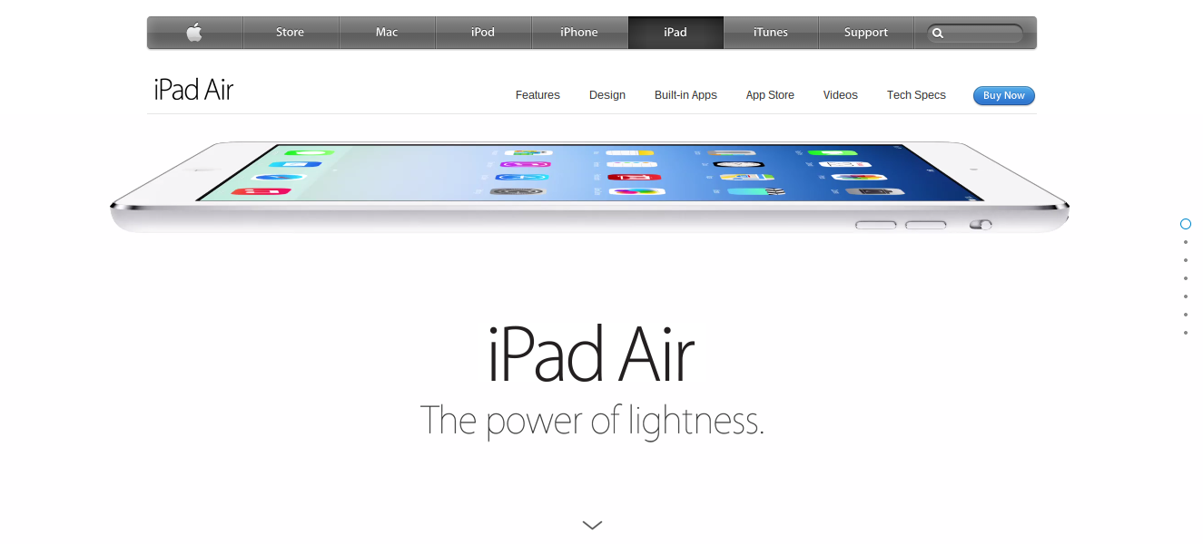
The below image is a screenshot of the landing page Apple have created for the iPad Air: Just like with Microsoft’s landing page, this landing page has good points to it but also bad ones too. These are listed below:
Pros
- Just like with all of Apple’s landing pages, it is extremely clean and has lots of free space so that the centre of attention is on the iPad Air. This increases the ‘wow factor’ of the tablet.
- Just like , Apple has adopted a slideshow. However, unlike Microsoft, it is a vertical manual slideshow. This is what landing pages should have because the web user should be able to scroll through and read the contents of the landing page at their own speed and not the speed at which the advertiser set the automatic slideshow to.
- The universal internal links at the top of the page takes up minimal space while giving the web user access to all areas of Apple’s website.
- There are internal links to different elements of the iPad such as Features, Design, Built-in Apps, App Store, Videos and Tech Specs. This enables the web user to see all they want to read about the iPad Air.
- The slideshow is a work of art. With a moving iPad that rotates around content that is to the point and enticing, it just makes you want to buy one!
Drawbacks
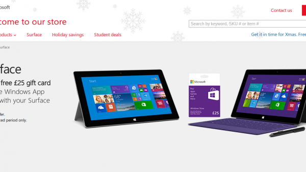
- Unlike Microsoft’s landing page, Apple are only advertising one tablet from their range of 3 being the iPad Air, iPad Mini with Retina Display and iPad 2.
- For some computers, the slideshow contains slight lag every now and then and can take a long time to load. This may annoy and frustrate web users.
- The navigation through the slideshow is not as easy as it seems. You can scroll from page to page easily. But, if you are on slideshow page 5 and want to go back home, you have to keep scrolling up or click on the top dot to the right of the screen (which can be quite difficult).
- Once you are on the slideshow, the internal grey links at the top that can take you to other areas of Apple’s website disappears preventing you from checking out other products.
- There is no Christmas theme to the landing page.
Ultimately, both landing pages are good at getting people to want to buy each tablets. has a landing page which includes just about everything to do with their tablets. Although I said it was a bad thing to be promoting different tablets in the same landing page, at least it gives some choice to the consumer who may want to find out the main differences between the tablets and buy the tablet that best suits their needs. With Apple’s landing page, it’s either the iPad Air or nothing. There is no alternative while in the slideshow. For this reason, I have to say, to my surprise, that Microsoft’s Surface landing page has won this landing page wars against Apple.
You must be logged in to post a commentLogin