This time of year (being around Christmas) is an important time for most businesses because it is the time of year most businesses make the majority of their profit. For this reason, it is vital to capitalise from PPC traffic and gain as many conversions as possible from people wanting to buy gifts for others. In this two part article, I am going to look at two companies (being Microsoft and Apple) and how their landing pages are good/bad and compare to each other. With both landing pages trying to sell a tablet to the reader, it will be interesting who will look like to gain more conversions in the end. This, my friend, is the landing page wars (Star Wars music starts…).
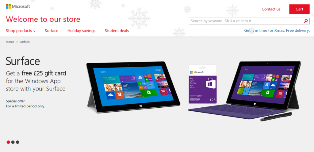
The first landing page up is Microsoft who have created a campaign based around the Surface, Surface 2 and Surface Pro:
 This landing page has good points to it but also bad ones too. These are listed below:
Pros
- There is a theme associated with Christmas due to the snowflakes as the top background. This immediately creates a ‘festive spirit’ which will encourage the web user to spend. The red internal links at the top add to the Christmas theme too. However, the theme does not scream out Christmas but subconsciously hints towards Christmas. The chances are most users won’t even notice the theme but subconsciously will (which is a good thing).
- Microsoft have recognised that delivery is a problem associated online when it comes close to Christmas. It is good that they have recognised this by adding in a ‘Get it in time for Xmas’ with ‘Free delivery’.
- The layout of the landing page is clean and simple. The page is not cluttered with lots of internal links which encourages the web user to stay on the landing page for longer.
- Although you can’t see it in the above image, Microsoft are encouraging the web user to scroll down by adding a snippet of text just above the fold which to read the web user must scroll down for. This same technique is used by Nokia too with their PPC campaign. Below the fold is where there is an expansion on what model Surface you can buy with all the features of the tablet.
Drawbacks
- The images are on a slideshow. I don’t particularly like slideshows because they don’t allow the web user to change when s/he wants to (instead, it is on an automatic cycle).
- The landing page mentions a free £25 gift card. However, people don’t really care about £25 worth of goodies when buying a £250 + tablet (up to £700!): especially at Christmas. They should have advertised the features of the tablet first to entice the web user into buying it.
- Who are they selling the tablet/s to? Microsoft have the Surface, Surface 2, Surface Pro and Surface Pro 2. The Surface is just an ordinary tablet with the Pro version being bit more productive with a digitizer and stylus. This is a problem since the landing page is trying to promote two products aimed at two different types of segments of the tablet market. Instead of advertising both, they have been vague with their description (only made points which apply universally to both tablets) which doesn’t really sell the tablets as well as it could.
Next up, we will look at Apple’s iPad Air landing page and it’s pros and drawbacks and then compare the two landing pages to see which landing page is better.
Click here to move onto Part 2 of this article which looks at Apple iPad Air’s landing page.
Will Green
Will created Ask Will Online back in 2010 to help students revise and bloggers make money developing himself into an expert in PPC, blogging SEO, and online marketing. He now runs others websites such as Poem Analysis, Book Analysis, and Ocean Info. You can follow him @willGreeny.
|
Recommended posts
|

