The last campaign I analysed in the ‘Analyse A Real PPC Campaign’ series was from Google promoting their new flagship smartphone line up: the Google Pixel and Pixel XL. Everything about the campaign was great except for the fact that the paid search advert was just above their organic search result, which both pointed to the exact same landing page – this begged the question why Google even made a PPC campaign if they were not going to make sure their search advert ranked a little higher than the bottom position of paid search results.
This article will be looking into the running industry, specifically running shoes. Therefore, without further ado, here is an analysis of a PPC campaign from MandM.
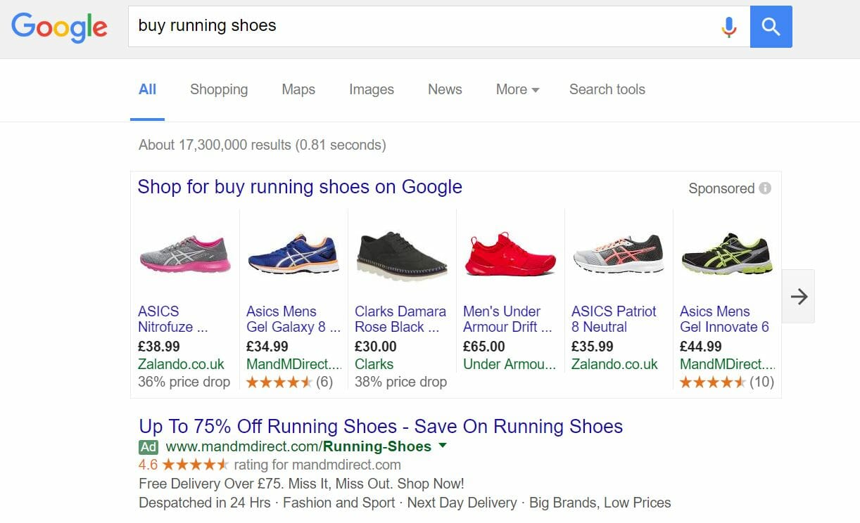
To view MandM’s PPC search advert, I had to type into Google search UK, ‘buy running shoes’: Straight away, it is interesting why MandM have made a search advert to begin with, considering the fact that the competition they will be fighting against will be from Google sponsored shopping results (which will always be preferred to the web user for this search phrase due to the fact that can visually see the shoe and price of it too). Putting this aside, there are a few reasons for MandM creating a PPC campaign for such a search phrase:
- They do not rank at all on the first page of organic results. Therefore, if they want to gain any traffic at all for quite a critical search phrase to a specific page, it will have to be through PPC.
- It is difficult to compete with Google sponsored Shopping results because price sensitive customers like the fact they can see the prices of the running shoes straight away. To combat this, the whole advert from MandM is completely and utterly about price savings, mentioning savings to the web user in both the title and the description. This type of promotional approach is not possible organically.
- It is interesting that two of sponsored Shopping results come from MandM too. Therefore, it seems they have a strategy to crowd out sponsored Shopping results and dominate PPC, so that the chances that they get a click from the web user on any of their adverts is relatively high.
After clicking on the above advert, I came to the following landing page: As a landing page goes, it is not too bad. There are both pros and cons to this page highlighted below:
- Generally, the navigation menu to a landing page makes a huge difference – a good one will allow the web user to navigate to any part of the website. Therefore, if the landing page is rubbish, the web user is still only one click away from navigating to the page they care about. The navigation menu on this page is great, and expands upon hover with many more options.
- I am not too keen on the colour combination. It is trying to be minimalist but has too much ‘random’ colouring – you don’t usually see white, blue, green and red altogether.
- Not much is going on the landing page – the content is most likely not going to be read (underneath the images of the running shoes) due to its small font size. Therefore, the web user is likely to scroll down, for which will enable them to view a selection of running shoes with pricing – this may have been something MandM wanted the web user to do.


You must be logged in to post a commentLogin