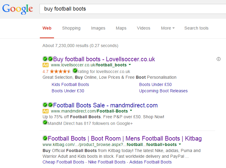
The last article in the ‘Analyse A Real PPC Campaign looked at a range of search adverts that had bid for the search term ‘switch bank’. As it turned out, this was quite a competitive search phrase to bid for which saw three adverts battling out for web user’s clicks (with uSwitch having, what I thought to be, the best advert). In this article, I will be looking at the sport market for football boots/cleats to see what adverts come up and the type of landing page one of the advertisers uses – Lovell Soccer.
To view Lovell Soccer’s PPC search advert, I had to type into Google search UK, ‘buy football boots’:
I thought it was also interesting about what the advert is about. Lovell Soccer sounds American since Soccer is an American word. However, I chose to use football in the search phrase. If your advert, like Lovell Soccer, has a word that can be spelt two different ways, I would suggest choosing one over the other. For example, if Lovell Soccer wanted to aim for just the UK and Europe, then they would bid for ‘football’. However, if they wanted to diversify into the American sport market, then they may want to think about using the term ‘Soccer’ too in a duplicated PPC campaign.
It is quite clear that Lovell Soccer wants to aim globally considering they have used football alongside soccer. This is reflected on the landing page where the web user can choose from seven different currencies from around the world.
After clicking on the above advert, I came to the following landing page:
- The black background is very bold. Black is the colour of dominance and often also referred to as fashionable which might be reasons to why Lovell Soccer used it.
- The menu navigation bar is a dream to use with floating options appearing is an easy-to-read layout. They have done a really good job of this in the sense that the web user will be able to find just about anything on the website within seconds.
- The layout of the boots is good although there is a description underneath each boot that is in quite a small font. Generally, landing pages need to be as text free as possible since it will bore the web user increasing the chances of them exiting the page. The good thing about this, though, is that the text does not appear above the fold.


