The last PPC campaign I analysed in the ‘Analyse A Real PPC Campaign’ series was from Dell, who had a mediocre PPC campaign considering the fact there were questions raised both for the search advert and landing page. In this article, I will be looking at the furniture industry: inparticularly beds. Therefore, without further ado, here is a analysis of a PPC campaign from Loaf.
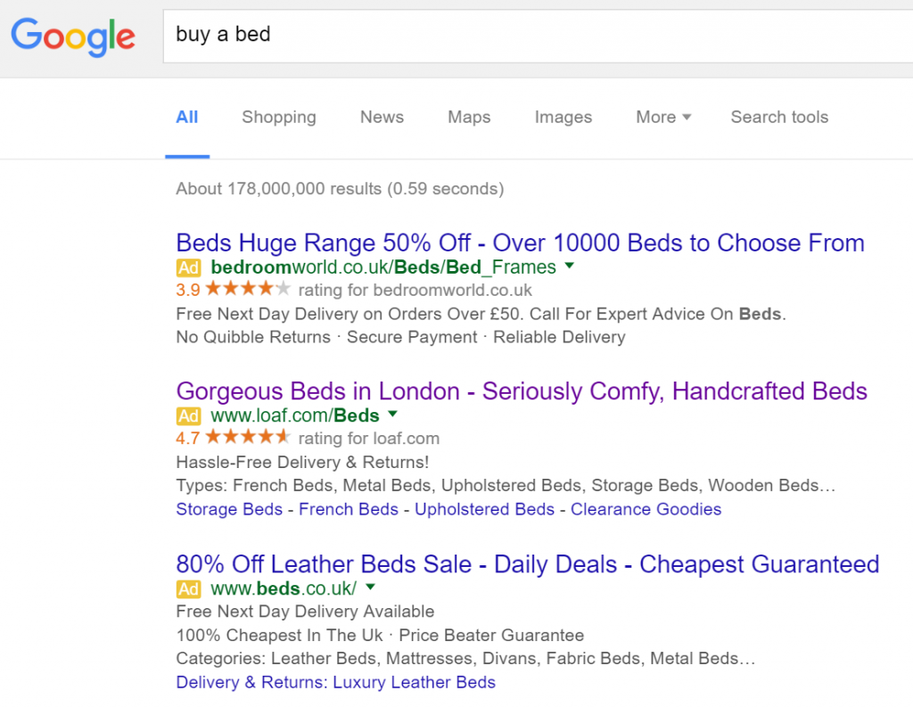
To view Loaf’s PPC search advert, I had to type into Google search UK, ‘buy a bed’:
Looking at the advert itself, it also seems to be approaching the search advert slightly different to the other viewable adverts. By this, the other two adverts are looking more price sensitively by claiming discounts, mentioning ‘Cheapest’ and numbers. There is no mention of anything in Loaf’s advert which will make the web user think ‘I am going to get a good deal’. With this in mind and the fact they mention it is based in ‘London’ and ‘Seriously Comfy’, it is all pointing towards being a high quality, luxurious brand name for beds. The rating will definitely help the advert make clear to web users that Loaf do a good job on beds – I am not too sure how effective the site links extension is in this advert considering there should be options to find the bed you want on the landing page.
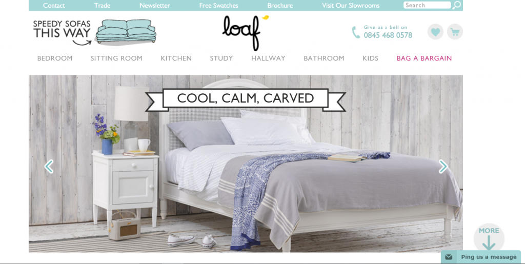
After clicking on the above advert, I came to the following landing page:
- The centre piece to this landing page is the bed image, which is on a slideshow to highlight the different beds Loaf offers. This will really help get the web user’s appeal for Loaf.
- The colour scheme is amazing as it is cool but colourful enough to compliment all the images on the slideshow. It also has a ‘homey’ feeling to it which is exactly what Loaf would be wanting to achieve with the landing page.
- The navigation menu is a dream to use. Upon hovering, the menu expands to many options so that the web user is bound to find the bed of their dreams.
- The landing page features content below the fold of the page. However, with the image nicely fitting the top fold of the page, there is no way of knowing there was content below the fold. However, Loaf have placed a ‘More’ button which, upon clicking it, scrolls the page a little down to show the web user the extra content. This is a great idea for which many advertisers should take note of.


