
J. Parker’s – Analyse A Real PPC Campaign 28 Apr 2016
The last PPC campaign I analysed in the ‘Analyse A Real PPC Campaign’ came from Audi, who we expected to have a well optimized search advert and landing page – they did not disappoint one bit. Using site link extensions and a large image of their cars on the landing page, they portrays an image to the web user of luxury and desirable cars.
With summer just around the corner now, it is great time for people to start preparing their gardens for plant to start blooming in a few weeks-months time. Therefore, here is a campaign analysis looking at buying garden plants from J. Parker’s.
To view J. Parker’s PPC search advert, I had to type into Google search UK, ‘garden plants’:
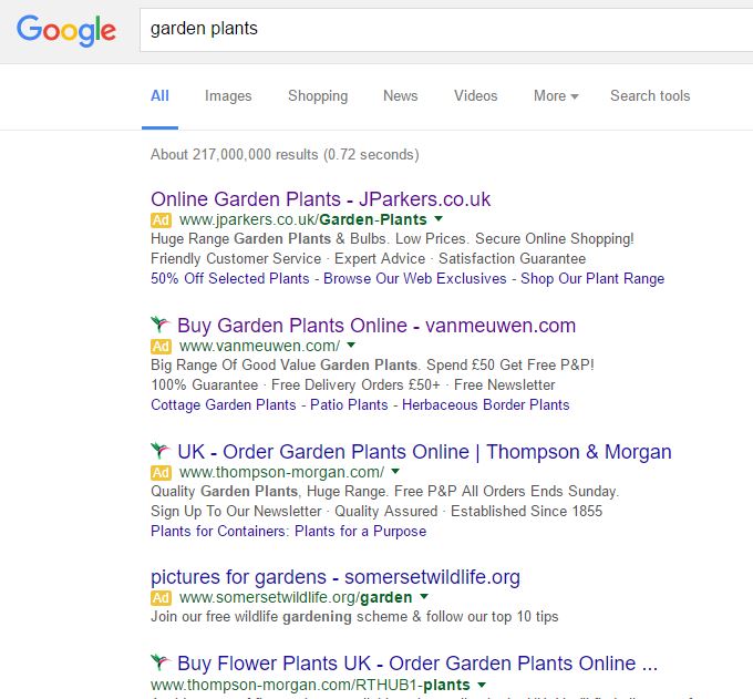 The thing I found interesting was actually Thompson Morgan’s PPC search advert. Even though I rank number one organically for such a keyword search phrase due to the high level of competition this has in PPC, they were forced into bidding for the same keywords to rank higher than their number one organic ranking result.
Looking at J. Parker’s search advert, it is a great example of how a universal structure can work well to create a well optimized advert (which is likely to have a high CTR):
- The structure of addressing the search phrase at the start of the title and finishing with the domain of the website is effective for pretty much any PPC campaign.
- The URL reiterates the domain name that features in the title. It also includes keywords at the end to make the advert seem even more contextual.
- The description is split up into many little enticements as to why you should shop with J. Parker’s.
- The site link extensions is a good extension to use: especially from the fact that it also includes two call to actions, the upper limit for CTAs in a search advert.
So, overall, this is a very good search advert!
After clicking on the above advert, I came to the following landing page:
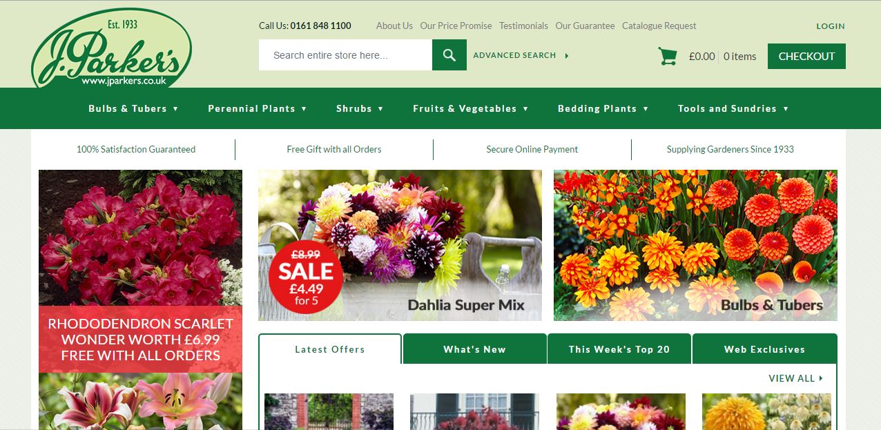 With J. Parker’s trying to promote their range of garden plants, I think they were always going to have an easy landing page to create. This is because they can litter the page with beautiful and colorful images of the range of plants they have on sale, which makes this landing page absolutely stunning to look at – I can presume the exit/bounce rate of this landing page is very low for such a reason.
With this in mind, there are other great areas to the landing page. J. Parker’s have associated a ‘SALE’ with the main central image which will help to address those that are more price sensitive. As well as this, the navigation menu is fluid, responsive and expands upon hovering to truly show the full extent of plants J. Parker’s have to sell.
The last point to this advert is the choice of colour scheme J. Parker’s went for. With them trying to sell plants, it makes sense to choose the theme colour as green, since it is most related to health, life and plants, due to the chlorophyll in the leaves of them.
So, again, overall, a brilliant example of how to create a great landing page and campaign!
Will Green
Will created Ask Will Online back in 2010 to help students revise and bloggers make money developing himself into an expert in PPC, blogging SEO, and online marketing. He now runs others websites such as Poem Analysis, Book Analysis, and Ocean Info. You can follow him @willGreeny.
|
Recommended posts
|
