It has been a while since my last ‘Analyse A Real PPC Campaign’ article since the last one saw me looking at and analysing . Analysing real life pay per click campaigns are a great way to find areas of a campaign which are good as well as bad. From this, you can then apply this new knowledge to your campaign so you can use the positive aspects of the analysed campaign to your campaign and get rid of the negative aspects too. In this article, I will be analysing the PPC campaign from Fragrance Direct.
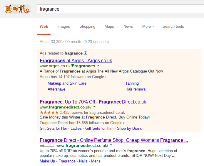
To view Fragrance Direct’s PPC search advert, I typed into Google search UK. ‘fragrance’:
Straight away, this advert begs the question, ‘why is it here?’
This is because Fragrance Direct are already ranked number one organically. Therefore, there are two possible reasons why they have created the campaign:
- To challenge competitors. As long as someone makes a campaign for that keyword search, that advert will always be above the highest organic search result. Therefore, Fragrance Direct needs to try and reclaim the top spot.
- To advertise a different sector of the website. Fragrance Direct cannot choose what shows up top organically. It is and always will be the homepage of their website. Therefore, if they want to advertise a different sector of the website, such as a sale of up to 70% off, they will need to create a campaign.
The advert is effective in gaining clicks because Fragrance Direct have included two call to actions. The first being ‘Save money this winter…’ and ‘Buy Online Today’. They are wanting an action from the web user which will encourage them to click on the advert.
After clicking on the search advert, I came to the following landing page:
The landing page is an interesting choice because Fragrance Direct have not made a dedicated landing page for their campaign but simply pointed their PPC traffic to a sales page on their website. Although it is advised to create a new landing page for your campaign, in the case of Fragrance Direct, they need not do this. This is because if they have a different theme to their main website, it will discourage the web user browsing through the rest of their website. This is why all of Amazon’s landing pages have the same theme as their main theme.
Looking at the colours they have used, Fragrance Direct have seem to have used black with a tint reddish-pink. From knowing what different colours mean to the web user, we know that black is a dominative colour with authority and power. Red is also known as the colour which makes people alert and emotional since it is strongly linked to the heart and love. Therefore, it can be deemed that the choice of colours by Fragrance Direct suit what they are trying to sell on their website.


