Over the past few months, I have looked at just about every sector of every market when it comes to analysing campaigns. Today, I will be looking at one of the biggest markets that are still booming: the car market inparticularly Ford who can be considered one of the largest car companies in the world. Therefore, by looking at their PPC campaign, we can gather some value tips on how to run our own campaigns to maximise the success out of them.
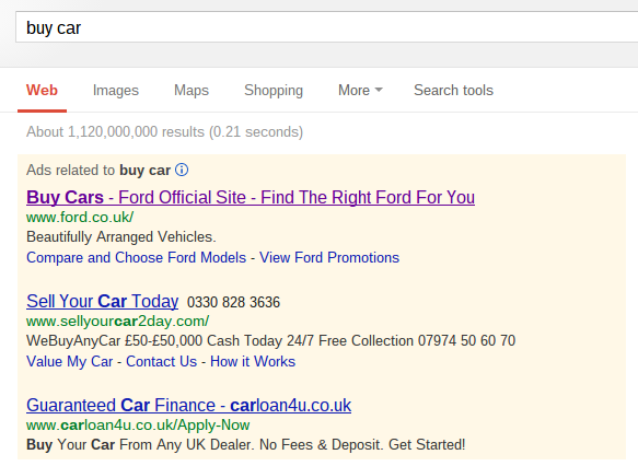
To first view Ford’s PPC advert, I typed into Google, ‘buy car’:
What I first thought about seeing these results is that Ford are the only car company that is trying to make the web user buy their own brand of car – the other two adverts are about selling cars and getting loans for cars. Putting this aside, Ford have been clever by making the first part of their advert’s title, ‘Buy Cars’, the keywords the web user typed. This grabs the advert extra attention. Therefore, it might be a good idea to make the first part to your PPC text advert’s title the same as what the web user searched for if you want to increase your click through rate.
I also noticed how significantly short the description is. This helps in emphasising what is being said in the description, ‘Beautifully Arranged Vehicles’. The description portrays the Ford cars as something people will want. However, the vagueness encourages them to click on the advert so they can see what this advert is talking about. What makes Ford cars beautifully arranged? Will I like them? How many vehicles can I chose from? All of these types of questions can be aroused from just three words in the description.
After clicking on the advert, I came to the following landing page:
It isn’t noticeable from the above image, but, the landing page uses flash in certain areas:
- Where is says ‘Cars ^’ in orange, the cars are on spinning around in a circle.
- The main image which, at the time the picture was taken, is on the Ford Kuga, this changes automatically to four other images on different cars and categories to do with Ford.
Overall, this is a great landing page. Above all else, the interactions web users can do with the landing page will entice them into using the landing page. As always, the main sidebar is to the left hand side of the screen which has internal links to other areas of the website. However, I think this has only been placed here to stop people bouncing away from the landing page if they don’t like the animated images (and also to give the PPC traffic access to as much of Ford’s website as possible).
However, a possible problem with this landing page is that for the flash to load (which is quite a lot), there will be a loading time much longer than the stereotypical basic landing page. For some web users who have relatively slow computers, this may become a slight problem: especially if the landing page is taking so long to load that the web user simply exits the page. But, since Ford are using flash, it makes clear that the benefits of using this type of animation far outweigh the negatives. I can understand why they are using flash too. To advertise a whole selection of cars can prove quite difficult in such a limited space. With flash though, the possibilities are then endless.


You must be logged in to post a commentLogin