Last in the series of ‘Analyse A Real PPC Campaign’ looked at SammyDress who seemed to have a campaign centred around women’s fashion although it was potential for men to go through to SammyDress’s website through PPC (reducing the overall conversion rate). 2013/14 has been surrounded by a new emerging market being the fitness tracking market. It seems everyone has gone mad with keeping up to date with how well we sleep, how many steps we take every day and so on (I admit I am one of these people and have a Fitbit because of it)! Let’s see what companies have used PPC to spread awareness of their fitness trackers.
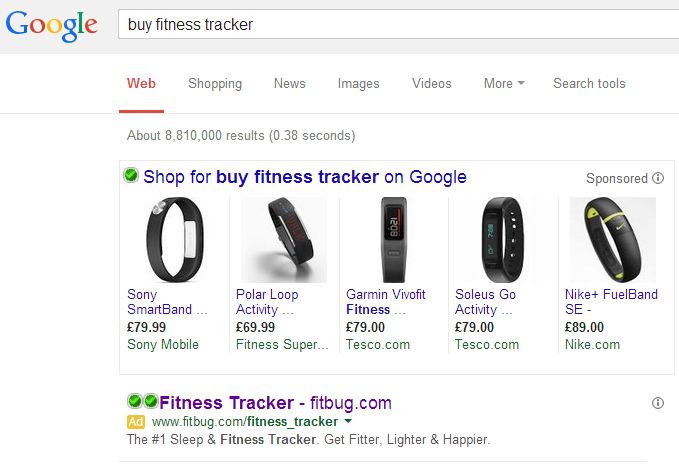
To view adverts from this market, I typed into Google search UK: ‘buy fitness tracker’: The first thing I notice is that the adverts at the top are not typical PPC adverts. Google has displayed fitness trackers from its ‘Shopping’ section – if the web user ends up clicking and buying on one of these trackers, Google gets compensated for it.
The only advert that is like a typical PPC search advert is at the bottom and Fitbug’s. Looking at the advert, it is actually quite well designed for these reasons:
- It is to the point. The title labels exactly what its about and also includes the URL so the web user, if she/he chooses not to click onto the advert, can remember the URL from the title and go to the website direct.
- The description labels the fitness tracker as ‘#1’. This makes it seem the best on the market although how it got labelled as #1 is still a mystery to us.
- The call to action at the end of the description is brilliant. They have given the web user an action to do (which, to achieve this action, they will have to click onto the advert). However, the call to action uses the rule of three which is when you include three things to strengthen your point.
After clicking on the above advert, I came to the following landing page: I am quite disappointed with this landing page. There are some good areas such as the top navigation bar which lets the web user browse through the website. However, the main area of the landing page is an area asking the web user to login. For the majority of web users, they will not have an account with Fitbug and neither would they want to sign up either.
The problem with this landing page is that it doesn’t follow where the search advert left off. The search advert was about fitness trackers so, at the very minimum, the landing page should be a product page highlighting the fitness tracker Fitbug are trying to sell.


You must be logged in to post a commentLogin