The last article in the ‘Analyse A Real PPC Campaign’ series looked at JCPenny who was one of many websites that had created a campaign to attract the traffic from black Friday. Although the pop-up message on their landing page was poorly optimised, the landing page itself was much better with a red themed design to induce a sense of urgency to the web user that these deals will only be here for a limited amount of time. In this article, I will be looking at another festive-themed holiday PPC campaign: this time on Secret Santa gift ideas.
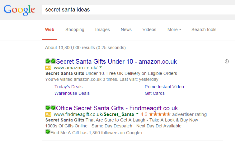
The campaign I will be analysing will be from FindMeAGift.co.uk. To view their PPC search advert, I had to type into Google search UK, ‘secret santa ideas’:
The advert has some other good points to mention:
- The keyword search phrase is in the title followed by the URL of FMAG which will help FMAG increase their direct traffic if the web user doesn’t want to click onto the advert (but remembers the URL).
- There is a call to action, ‘Take a Look & Buy Now’ in the description which tells the web user exactly what FMAG want them to do.
The only downside to this advert is the fact that, due to using too many characters, ‘Next Day Delivery’ has been forced to shorten down to ‘Next Day Del’. Although I understanding ‘Del’ means delivery, delivery is not a word that is commonly shortened down.
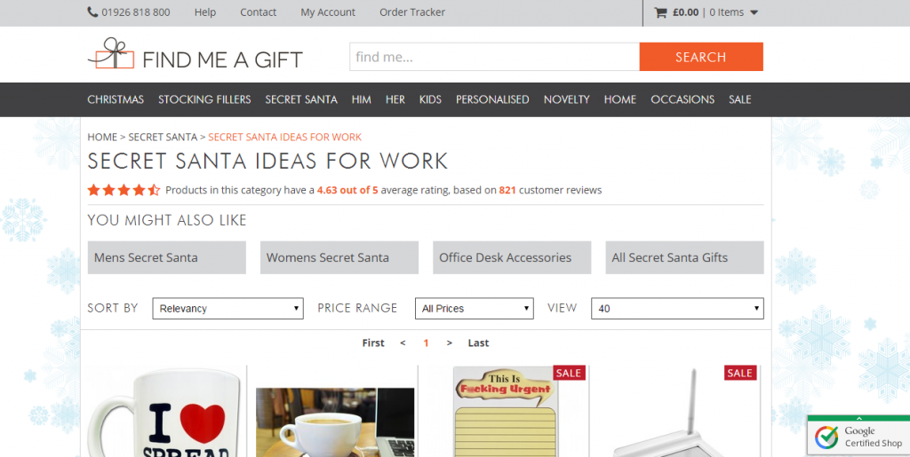
After clicking on the above advert, I came to the following landing page:
- Of course, with the contents of the page, the theming has to be festive. The moving snowflakes background compliments the theme of the website without taking over the prime space of the landing page: where the Secret Santa products are.
- There is a navigation menu with hover availability to expand each link as well as all the necessary information to contact or shop around FMAG.
- For a shop, it has all the neccessary information and drop downs to help the web user find the gift he or she wants to buy as quickly as possible.
- Since the web user searched ‘secret santa ideas’, they are unsure exactly what they type of gift they want to buy. By making the images on the landing page go slightly below the fold encourages the web user to scroll down and look through the selection of gifts FMAG have up for offer.


