The last PPC campaign I analysed in the ‘Analyse A Real PPC Campaign’ series was by Tag Heuer, who were looking to capitalize on loved couples who each wanted to buy gifts for their other halves for Valentine’s day. However, what we found was that the landing page did have a few areas it could have been improved. In this article, I decided to look at the competition that would occur if I wanted to buy a vacuum cleaner: it’s something everyone will need if they have a house! For this reason, here is a PPC campaign analysis of Dyson.
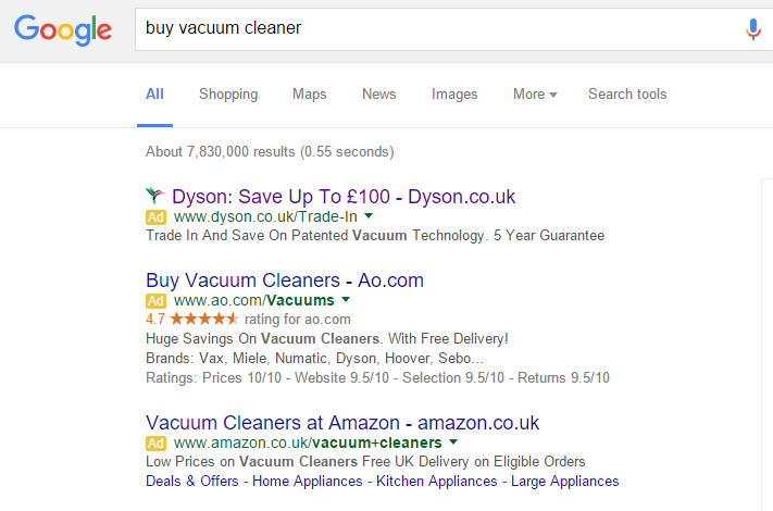
To view Dyson’s PPC search advert, I had to type into Google search UK, ‘buy vacuum cleaner’: Straight away, we can see there is a lot of competition for such a keyword search phrase and so there should be – it is also clear that Dyson have paid the highest CPC to gain the #1 spot on paid search results in order to get as much traffic for such a crucial keyword search phrase.
Looking at the advert itself, the advert is simple and short. In PPC, there are two main approaches to PPC search adverts. You can either go all out with ad extensions, lots of content and using up all the space possible. There is also the other option which is to keep things short and sweet – this usually gains a good CTR too since you are providing just enough information to get web users intrigued enough to click on the advert. This is what Dyson have done by stating a £100 saving and by mentioning ‘patented technology’. How comes there is a £100 saving? What is the patented technology and will it give the vacuum cleaner a performance increase as compared to competitors?
After clicking on the above advert, I came to the following landing page: Now this is a great example of a landing page. It can be seen to be closest to that of a product/service page. It has many great features listed below:
- The center attraction of this landing page is the image that directly addresses what the ‘patented technology’ was. By showing this technology in action really gives the impression that Dyson is a premium brand in vacuum cleaners and is constantly pushing the technological boundaries to improve the performance of their vacuum cleaners.
- If the web user scrolls down, there are more images which highlight the USPs and features of the Dyson vacuum cleaners, as well as the range Dyson have on offer.
- The navigation menu is a drop down so that the web user has the potential to go to just about any page on Dyson’s website in an easy manner.
- There are hints that this landing page is a hybrid landing page: it can also be seen to be a click through page since there is a button Dyson wants the web users to click onto placed in the middle of the page ‘Explore Uprights’. If they wanted to gain more clicks from this, I would suggest they make the button and font of the text inside the button larger as they have plenty of unused area to do this without affecting any other part of the landing page.


You must be logged in to post a commentLogin