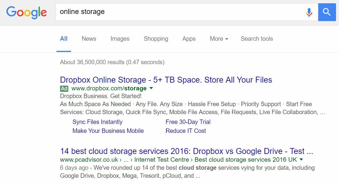
The last PPC campaign I analysed in the ‘Analyse A Real PPC Campaign’ series was from VoucherCodes, who had targeted for top spot of paid search results with this search advert and also had a very well optimised landing page with an easy-to-use search bar taking the prime central location of it. With storage of photos, documents and more becoming more and more important to people as their data usage increases, I thought to look into a market that wants reoccurring sales. For this reason, I looked into online storage for this PPC campaign analysis and Dropbox.
To view Dropbox’s PPC search advert, I had to type into Google search UK, ‘online storage’: Straight away, the first thing I notice is that there is no other competitor for such a keyword search phrase. I find this a little strange since the online storage market has the potential to make alot of money from one person if they can keep them into renewing their subscription monthly for online storage.
Organically, Dropbox appears 5th for this search result – they have potentially used PPC to make sure they are seen first and to ‘make up’ for their organic search result not achieving top sport organically for this search result. This makes sense since Dropbox wants to achieve a brand awareness that as soon as consumers think about online storage, the first company that they think about is Dropbox – this can be achieved with this PPC campaign.
On the whole, the advert is also very enticing, offering many reasons to join Dropbox which continue into the site link extensions – one reason to use site link extensions is that you can use them to provide more reasons to click on the advert (or site links) and perform a conversion.
After clicking on the above advert, I came to the following landing page: My first impressions of this landing page is that it is designed very well. It is clear it is a click through landing page from the large ‘Start free’ blue button being the focus link on the landing page. Keeping the page simple with one simplistic image and large clear font helps make the landing page easily digestible to the web user, further reducing the chances of the web user exiting the page.
The only thing I am confused about with this landing page is that Dropbox, in the top left, is referring to Dropbox Business in this landing page. Upon clicking on the ‘Start free’ button, it is confirmed that this landing page is referring to businesses that require online storage and not for personal use. With this in mind, the whole PPC campaign has been targeted wrong. ‘online storage’ as a search phrase does not immediately refer to businesses wanting online storage but either businesses or consumers. The only reference to business in the search advert comes from one of the site links, which is not obviously enough to web users that this landing page is only looking at Dropbox for business. Ultimately, this landing page is great. But, it has been wrongly targeted using PPC.


You must be logged in to post a commentLogin