The last PPC campaign I analysed in the ‘Analyse A Real PPC Campaign’ came from Perkbox, who had, what seemed like, a generally poorly targeted campaign. Such a campaign would really have dented the holiday budget Perkbox would have set aside to capitalize from the Christmas shopping rush.
With Christmas getting ever closer, I thought it would be a good idea to continue the Christmas spirit by looking at a PPC campaign that would be selling Christmas jumpers. For this reason, without further ado, here is a PPC campaign analysis of Debenhams.
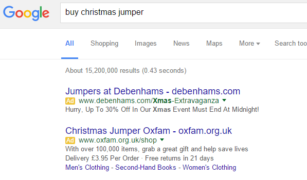
To view Debenham’s PPC search advert, I had to type into Google search UK, ‘buy christmas jumper’:
- The brand name, Debenhams, is mentioned three times in the advert, solidifying the brand awareness of Debenhams.
- The URL reflects what the web user searched for.
- The description is what will entice the web user in the most. As well as causing urgency, there is a price reduction which web users always love. Urgency + price reduction = winning PPC campaign. For example, compare the description to Oxfam’s who mention delivery of £3.95 in the description…
There is one thing I would have changed in the advert: the title. It is obviously seems like a christmas styled advert. Therefore, I would have addressed the web user more directly by explaining somewhere in the advert that the jumpers were ‘Christmas jumpers’ or ‘Holiday jumpers’. Remember that the more contextual your advert is to what the web user searched for, the higher the chance the web user will click onto the advert.
After clicking on the above advert, I came to the following landing page:
To some extent I can understand why Debenhams have done this. The advert is unisex – it does not specify what gender or age it is targeting. Therefore, they are always going to have to have an intermediate landing page that acts as a click through page to guide the web user to the gender/age range that the web user is specifically looking for.
However, my main discontent is the fact that the search advert is a Christmas advert. The landing page has no Christmas theme or anything relating to Christmas at all. For Debenhams, it would have been far more effective to have a Christmas theme or an image of one of the Christmas jumpers they have on sale to make this intermediate click through landing page relate that bit more to what the web user originally searched for.


