The last PPC campaign I analysed in the ‘Analyse A Real PPC Campaign’ series was from J. Parker’s, who ultimately had a pretty good campaign that aimed to promote their range of gardening plants they have for sale to the web user. Keeping to the same topic of summer, here is a look at a campaign that is aimed at targeting those looking to book a summer holiday – now is usually the time people start thinking about booking summer holidays. Therefore, without further ado, here is a campaign analysis from Center Parcs.
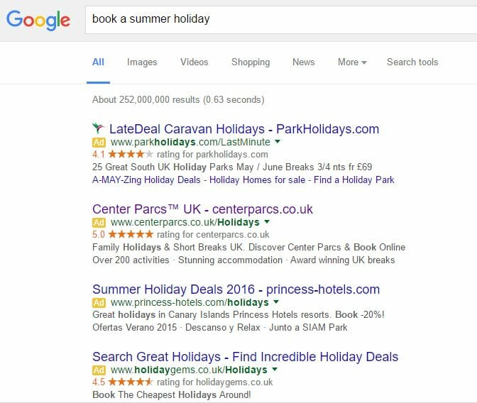
To view Center Parcs’ PPC search advert, I had to type into Google search UK, ‘book a summer holiday’:
We can also see the use of the new four adverts structure with this search phrase too – it is interesting to point out that not one organic result appears above the fold in this case, which will tend to happen as the four advertising campaigns look to use ad extensions to compliment their advert.
Looking at Center Parc’s advert, it appears that their main USP is the name ‘Center Parcs’ itself, such that the brand name is enough to get people to click onto the advert to see what the Center Parcs styled holiday is all about. This is achieved through the use of the trademark symbol in the title, that makes the brand name/image of Center Parcs look well established and better than the other brands of the other campaigns.
It is also a good use of the customer review ad extension. Center Parcs realize that the 5.0 stars out of 5 would be very effective to convince people to click onto the advert and explore the landing page, hence why they included it in the advert. As well as this, since the customer rating is higher than any of the competitor’s, there is now a quantifiable reason why the web user should choose to click onto Center Parc’s advert as compared to its competitors.
After clicking on the above advert, I came to the following landing page:
I can see why Center Parcs chose to do this as by advertising their holiday package without pricing first will lure web users into wanting to go there on holiday: once they have gone through the whole booking procedure.
However, at the same time, I think the lead capture of the booking at the bottom could have been designed a bit tidier and more ascetically pleasing to look at. We must also think about the type of people that will land onto this landing page – will they be in a situation ready to put in such information about when to go on holiday, where and with who? I am not too sure every single person will be confident enough to request straight away and it might just put people off progressing any further with this landing page.


