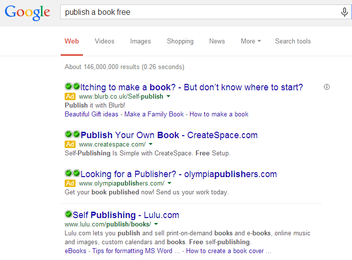
Continuing the ‘Analyse A Real PPC Campaign’ series, the last article in this series looked at search adverts for the search phrase ‘make money online’ which helped key out some tips for advertisers to use when creating and optimising their own search adverts. In this article, I chose to look at adverts I am personally a little interested in since I am going to be publishing a book in the not too near future. For this reason, here is an article analysing the PPC campaign of Blurb who publish and print books for authors.
To view Blurb’s PPC search advert, I had to type into Google search UK ‘publish a book free’:
What is also interesting is the contents of Blurb’s advert. In the title, they choose to ask two questions to the web users. This is a good technique to use since it is making the advert seem more human like there is a team at Blurb that know what authors are going through when they want to publish books. The description is relatively short since it is the answer to the title’s questions – to publish with Blurb. Blurb also chose to have extra links below their description to make it possible for web users to enter different and more specific landing pages to fit their needs. All in all, it is a good search advert that will naturally get a high CTR.
After clicking on Blurb’s search advert, I came to the following landing page:
I have to admit that this landing page is beautiful. Blurb have used everything which makes landing pages successful:
- Minimalistic design to prevent exits.
- Pictures to make the page look better and share information in an easy to read context.
- A video to display information in an easy to digest context.
- Clear and larger font to make it easy for web users to read.
- The only links are to social media websites at the far bottom or the two ‘Get Started’ buttons. Therefore, the fact there is the bare minimum to click on makes the chances that the web user clicks on the ‘Get Started’ button much higher.


