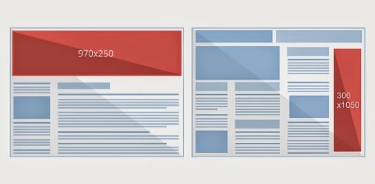
As promised, here is a a review of the recently released advertising units from Google Adsense. Google Adsense made a step in  the right direction a few weeks ago by introducing two new and much larger ad sizes for units: 970×250 billboard and the 300×1050 portrait. At the time of the release, I thought this would be a great idea as they work hand in hand with other advertising sizes such as the 300×250 unit and 160×600 unit. As well as this, they are much larger and anything that is larger on a website is more likely to be seen and clicked on. Below are the main benefits and drawbacks to these new advertising units which I put up on my own website for one week to see how they performed.
Don’t Look Ridiculously Big
The first thing I noticed about advertising units so large is that they really don’t seem to take up that much spacing. When text adverts are being displayed, the majority of the space is background space making the advertising units seem much smaller than they actually are.
This is the main concern which publishers will face. They will not want to stick such large adverts onto their websites since they take up so much space and have the potential to make their website look bad. However, this is Google we are talking about. They know this and they have managed to make text adverts look relatively minimalist against websites which is great news for publishers wanting to try these units out.
Poor Performance
However, as nice to look at as they might seem to be, the truth is that they did not make as much money as my previous 336×380 and 300×250 adverts did. For that matter, they didn’t make anyway near the same amount of earnings. The performance of these new adverts were pretty dam poor for something that takes up the majority of space on a website. However, I think there are reasons why they are not performing too well:
- No competition – What drives up the CPC of advertising spots is the competition between advertisers. If there is much more advertising units to bid for, the price per spot will not be as high as it would be for smaller advertising units. Therefore, your CPC will decrease (which it did for me).
- Image adverts just don’t work yet – These advertising units are in the early stages of their lives. At the moment, the text adverts are optimised for these sizes. However, the image adverts are not. If images adverts are displayed, you will find that one 300×250 advert will be displayed in the middle of the huge space by itself. This is just a waste of space and another reason why the new larger units are not performing as well…yet.
- Web users maybe unsure? – We sometimes slate advertising units for looking too much like adverts. However, the fact is that because they look like adverts to web users, they are likely to view them as adverts and click on them. For new larger units, if web users cannot see them as adverts from a first glance, what else do they view them as?
- Too many adverts – With such large sizes, you will find that there are much more text adverts being displayed at one time. Web users need to only really see one or two adverts and then choose between them – if the web user reads all of the adverts on these large units, they will be reading all day!
Ultimately, I think these adverts are good and will be successful: just not right now. Adsense needs more advertisers to create adverts around these new sizes so that they can increase competition for these size units and create custom sized adverts just for these units.


You must be logged in to post a commentLogin